Architecture and Design
 Architecture is all about shapes and their relationship to the surrounding environment. Planes, negative space and the golden ratio — geometry plus art equals architecture. When working on designs, knowing a few architectural basics can add dimension to your work.
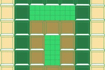
In architecture, every line you draw is really a two-dimensional (2-D) object called a plane because it has length and width. As surface designers, we mostly work in 2-D already because, normally, we don’t draw lines that never connect. Thinking about your shapes as objects rather than lines can help you see the relationship of all the pieces together. In architecture, there are negative spaces (voids) and positive spaces (what you draw), both of which are objects that affect each other because of their volume. In the attached image of my homage to the Chrysler building, the work was done in dark green, but the negative space (voids) in grey created a dominant shape in the repeat. When you think about the shapes that you draw and the shapes you are creating by drawing, that is an architect’s daily bread. It may matter more if an architect creates a void that damages an existing structure, but it is a good lesson for designers, too. Thinking about the negative space as something that interrupts your objects can help you create good depth. If I didn’t use a lighter color to cause the dominant void to recede, this drawing would look quite different!
Additionally, applying the golden ratio can create balance in your designs and repeats. The golden ratio, a legacy from the Greeks, says length divided by width equals pleasing proportions at a rate of 1.618. Loosely translated, this means that objects like rectangles designed in proportion, and not the same size, are universally appealing. For example, drawing a work within a rectangle and then using another rectangle scaled down by 61.8% (or up by 161.8%) gives you the golden ratio. Let’s look at the Chrysler building drawing again and see that golden rectangles are the fundamental building blocks, vertically and horizontally grouped. Is it universally pleasing? That, of course, is a matter of taste.


1 Comment
mo · June 17, 2013 at 12:26 pm
Fascinating!
Comments are closed.