Think Linear
 Linear decoration is one of the key components of deco design. It was the roaring 20’s, after all, and skyscrapers were popping up left and right. Trams and rails decorated city streets that ran for miles and now you could view them from above, like ants traveling complicated grids. Modern items became sleek and stylized and buildings were decorated with lines instead of busts of their wealthy patrons.
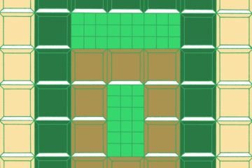
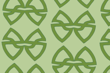
It’s no surprise, then, that designers worked with rectilinear repetition. By creating units of design, it is fairly easy to work them into long lines of pattern. In the image at left, I took a motif and mirrored it, then ran it like back-to-back cars down the page. For that extra deco touch I chose diamonds and a standard stripe. The overall impression gives off an idea of streaming traffic minding it’s lane with occasional stop lights monitoring the rows.

