A Word on Creating Texture

An often underplayed card in design is a good use of texture. Texture adds depth of field through layering, variation, and shadow.
Imagine for a minute that you have in front of you a ball of red string. It’s not really a solid color because there is endless variety as light refracts off the yarn. Think of Monet and his use of seventeen colors to paint a tree trunk. Monet is a master of texture.
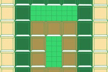
A good design can still give the impression of texture even with a handful of colors. This design has only three colors, but the variation in the square sizes adds depth, as does the linking of images to project overlap. A little shadow is created when outlining the objects in a third, intermediate color.
There are lots of times in design work when limited color palettes are not only appealing, but necessary. Full color runs can be expensive, so honing your texture skills can create more opportunities in which your work can appear. For artists who love color, it can feel limiting to work with so few choices, but it’s a good challenge and, as artists, challenges build our skills!