A Conundrum: Designing Old School versus the Digital Age
 Since I have an art background, I like the feel of gliding my ink pens on a piece of thick paper. The touch, the visual aspect and the time involved in pondering the line itself are all rewarding to me personally, but some designs can only be done in your digital editor of choice (mine is Adobe Photoshop at the moment). Achieving gradations in color can be done manually, but the results are never as precise. Blurring lines, applying varying digital techniques, rendering the final images — all of this requires a sophisticated digital hand.
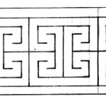
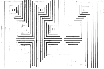
Don’t get me wrong, I welcome all the bells and whistles, the time-savers, the overall finished polish of a touched-up design, but I admit, more often than not, I like to sit at my giant drafting table with pen and paper feeling the image as much as drawing it. I was recently drawing this variation on the Greek key, carefully setting in my grid in pencil before lining the work in ink and I admit I was debating about using a simple grid overlay in Adobe for what is rather a fast design, really. I did not succumb to the pressure because I do think there is something charming about a hand-drawn line. The tiny imperfections mean something somehow. The curve that goes a little out of whack, the extra thickness here and there, a bit of an ink dot. When they are put onto fabric, they add something a digital design can never achieve: the human touch. Admit it, many times we have all examined something at close range just looking for a comforting flaw. And, in a way, I like to use the same tools the original Greeks did when they created these complex geometric designs, which are all the more charming for the slightly-flawed skilled carvings that grace stone structures so much taller than I.

